WinPicks Reference Manual
Section 7.3. Viewing Statistics with Pro Football Analyst
All members of the WinPicks family allow you to view statistics by selecting STATISTICS from the VIEW menu. PFA includes all of the actual game statistics in its database, and allows you to view these statistics by team or by category. The databases for Pro Basketball Analyst (PBA) and College Football Analyst (CFA) only include the game scores and lines. The following sections explain the three ways to view statistics using PFA:
- By selecting a statistical category
- By selecting a team
- By displaying statistic charts
Viewing Stats by Category
You can view stats by category by selecting STATISTICS from the VIEW menu and then selecting BY CATEGORY. You'll see the menu shown in Figure 7.30.
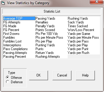
Figure 7.30 - The View Statistics by Category Menu (PFA only)
The menu lists the 32 statistical categories that you can view. Before selecting a category, use the Type box in the bottom left corner of the menu to choose between offensive and defensive stats. Keep in mind that a few stats ("Winning Percentage", for example) are identical for both offense and defense. After you select a category, all teams are listed in the order of their league ranking as shown in Figure 7.31. The name of the currently selected team is shown in capital letters. The two columns to the right of the team's name show the stat totals and the per game average.
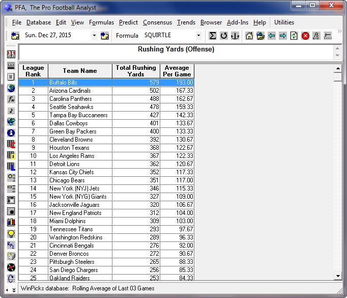
Figure 7.31 - Viewing a Statistic Report (PFA Only)
All stat reports are sortable by column. Clicking any column heading will sort the teams according to the information in that column. For example, click on TEAM NAME to sort the teams in alphabetical order (A to Z). Click it again to sort the teams in reverse order (Z to A).
Viewing Stats by Team
You can view stats by category by selecting STATISTICS from the VIEW menu and then selecting BY TEAM. A menu containing all of the NFL teams appears. When you select the team you want from this menu, you'll see a screen similar to the one shown in Figure 7.32.
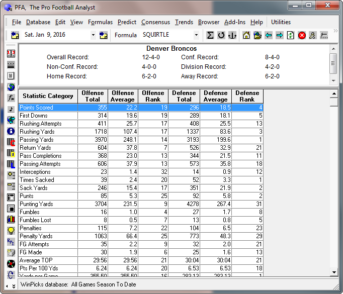
Figure 7.32 - Viewing a Team Report (PFA only)
The top part of this screen shows the team's overall won/loss record, their conference and non-conference record, and their record within the division. The rest of the screen shows the team's stats and league ranking in each offensive and defensive category. For example, a rank of 1 in the Points Scored category means that the team is the highest scoring team in the league. Keep in mind that the rankings are based on the database method currently in use. If a 3-game rolling average is in use, this means that the rankings are based on each team's performance in their 3 most recent games.
Viewing the Leaders Report
To view the top two and bottom two teams in every statistical category for both offense and defense, select LEADERS from the VIEW menu. You'll see a screen similar to the one shown in Figure 7.33. The defensive categories are listed below the offensive categories, so you will have to scroll down to view them. Keep in mind that the leaders reports is based on the database method currently in use. If a 3-game rolling average is in use, this means that the rankings are based on each team's performance in their 3 most recent games.
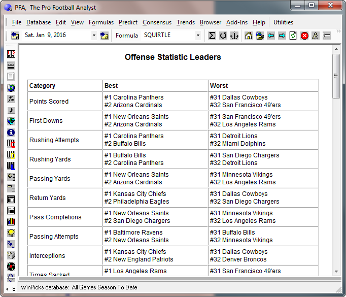
Figure 7.33 - The Leaders Report (PFA only)
Viewing the Yardage Rankings
This handy display allows you to quickly rank all of the teams based on their yardage gained/allowed statistics. To view the yardage rankings, select STATISTICS from the VIEW menu and then select YARDAGE RANKINGS. A display appears providing a quick summary of the league's best offensive and defensive teams. The handy three-column display ranks the teams in the order of yards gained, yards allowed, and yardage differential (yards gained minus yards allowed).
Viewing Stat Charts
One of the most powerful features of PFA is its ability to display statistic charts. There are three different ways you can use the CHARTS feature:
- When a team report is being displayed, select a statistic from the report. Double click with your mouse, or press ENTER after highlighting the statistic you want.
- When a statistics report is being displayed, select a team from the report. Double click with your mouse, or press ENTER after highlighting the team you want.
- Select STATISTICS from the VIEW menu and then select STAT CHARTS.
After you select STAT CHARTS, the CHARTS window appears as shown in Figure 7.33. The CHARTS window has two drop-down lists that let you change teams, or change the statistical category. This lets you chart the performance of any team, in any statistical category. A third drop-down list (on the right side of the window), lets you select the type of chart to display. There are five different types of charts:
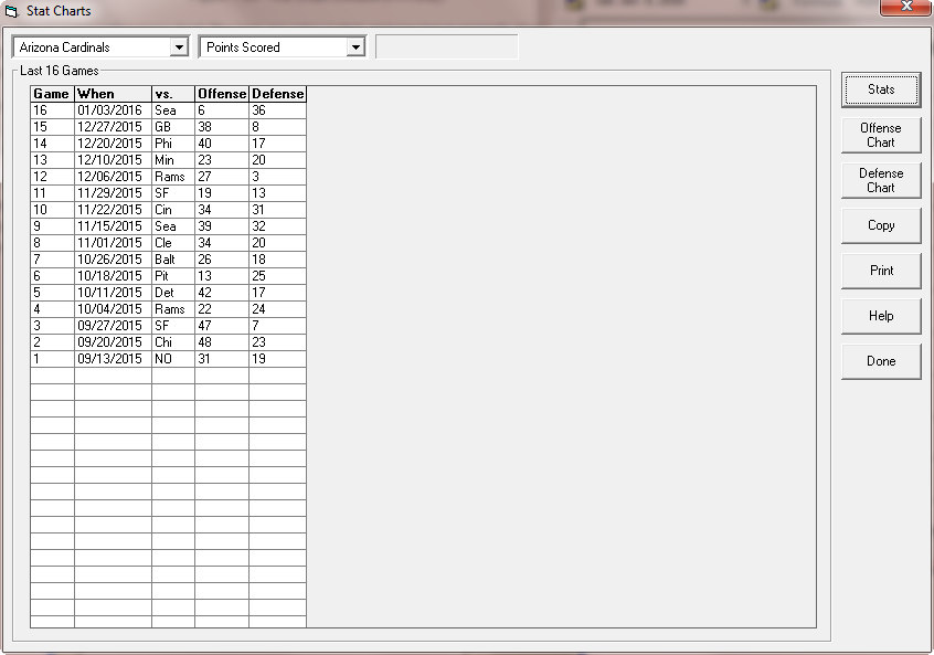
Figure 7.34 - The Chart Window (PFA only)
2D Bar Chart - This is a conventional bar chart. The bars are color-coded, and one bar is normally displayed for each game in the database. However, if a team did not register any statistics in the selected category for the game, no bar is present. In other words, if you produce an interception chart and there were no interceptions, there will not be a bar.
3D Bar Chart - This is also a conventional bar chart, but it is more elaborate than the 2D version. The bars are displayed in three dimensions, so you can see the top and side of the bar, in addition to its face. As with the 2D version, one bar is displayed for each game in the database.
Line Chart - This is a standard Cartesian graph, where each game represents one data point on the x-axis, and the statistics are plotted on the y-axis. A solid line is used to connect the data points. A dashed line shows the slope of the data after linear regression is performed. By looking at the slope of the dashed line (whether it goes up or down) you can tell if a team's performance is getting better or worse in the selected category. Figure 7.34 shows a sample line chart.
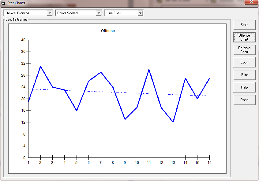
Figure 7.35 - A Sample Line Chart (PFA only)
Area Chart - This is similar to a line chart, except that the area under the line is filled in using a solid color. The data slope is not shown.
3D Pie Chart - This is a traditional pie chart, where each game represents one slice of the pie. A pie chart is useful for a small number of games (a 3-game roll, for example), but can be confusing if the number of games is too large.
You can display either offensive or defensive statistics, or display the data in a tabular format (instead of a chart). You may also copy a chart to the Windows clipboard, or print the chart.
- Click the OFFENSE CHART button to view offensive statistics
- Click the DEFENSE CHART button to view defensive statistics
- Click the STATS button to display tabular data
- Click the COPY button to copy information to the clipboard
- Click the PRINT button to print
- Click the DONE button to exit CHARTS


